Just like one other person said.
They need to hire an Italian.
They almost got the design right if not for the silk screening.
Why?
See how much better it looks the less "Microsoft" it gets? Save the money on the printing.
People who buy this stuff are not impressed by it. Its like adding a wing to a car that just takes away from the great lines of a car.
A better look is something like this. K.I.S.S. Simple. Elegant. Proper.
How to do it right?
Simply. beautiful.
And lets be honest. Why do people spend
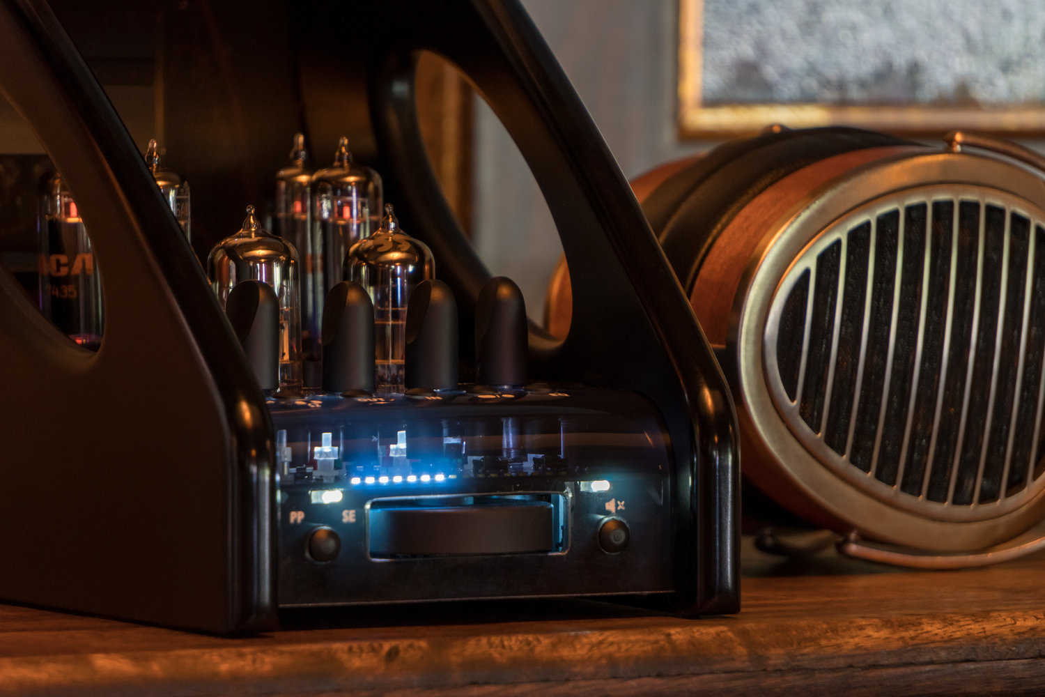
5k on a headphone amp? Because it makes you feel good using it! You come home and you look at it, and it reminds you that someone put their soul into it. You can almost feel the design of the artist who wanted to tell you how good the music they played on the Amp made you them feel.
Just look at those Knobs!
And notice the print and font. Its not perfect. Its just artistic.
Its not even finished that well. But its the ART and the WAY they did it that makes it what it is. They are not pretending. They simply put it out there and do it even by hand. It has a human touch to it. All these things help you connect to the experience and music.
Now compare this unit I got for my Kid. The layout is retarded. But they make no apologies about its design and it's simply just there. The tubes don't even match each other. No frills on printing. Just what you need. And once you plug it all in? You won't ever see the
IN and
OUT nor
"Volume" . They just said:
-------
WE are going to make a TUBE Headphone amplifer! Screw all the crap that does not matter to the sound. Lets make it simple, clean & easy to use and call it a day! ------
.
More evidence of it here:
Its simple. No trying to be what it is not. Its honest. And they want you to have fun with it.
They even go as far as telling you what tubes you can roll with it. No where do they mention some Mythical BS about what it is not. And I like that.
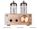
FX-Audio IMO?
1. Drop the FX-AUDIO- and go to FXA. Save that for the back of the unit. IN SMALL TEXT. If you want to name brand it? Do it right.
2. Drop the
"PRO". Its like
"Heavy Duty Batteries"
This is what "PRO" means in the western market..
3. Simplify the design and get rid of the text. No one uses DOS anymore...Everyone uses Icons today. And you wont have to make custom prints in other languages. You are in a WORLD market. Start acting like it.
4. Drop the
"High Quality" BS... You sound like a a politician or car salesman. You already know what the stigma of having The Stereotype of items coming from China already is.
Use something like this:
Make it a POINT that you take PRIDE in your gear and the people who make it.
You have a beautiful way of writing your characters so exploit that.
<<<Do more of this.
Less ROBOT English font.
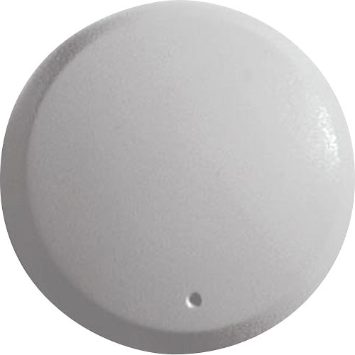
5. Your making a product for people who listen to music. They know where their volume is at. So save the money on the crappy silk screening. Just go less is more. Its the MOST important part of your product as its the MAIN thing they are going to feel. Go with a Simple Dimple. Its elegant. Its way better looking. And costs less labor too.
You could even use Rubber feet at less
then a Penny each as the knob and give it a great feel at a Budget price! It will set it apart. There are already to may of these items on the market. You have to set yourself apart.
These from china cost me with free shipping less then $4.00. I bet you can get these for less then 5 cents there in quantity or less. This would make your product stand out. Hell, I bet you could get used ones and call them "Green" and market that too!.
I'm just saying. There is a LOT more that could be done to make this a stand out instead of another item that there are many of already. With the downturn in the world economy? You have to stand out. Price alone is no longer what works in a flooded crowded market.
Fx Audio already makes cool stuff. But its getting tired and old seeing the same old stuff year after year. You got the meat and potatoes, you just need to add the Tabasco!
Respectfully,
The people who buy your gear. 

")
.jpg)